The Future of Food is an anthology of essays made by the Fall GRPH 221 class in 2019. The collection includes scientific essays, futuristic articles, and more. The main goal of this essay was to explore editorial design though layouts, images, text, and color. We were asked to push the limits of text/image relationship, visual hierarchy, and making the spreads cohesive.
The essay I have chosen is a scientific article about genetically modified organisms or GMOs for short. The content of this article is about the current use of GMOs, the risks and benefits of GMOs, and the unintended economic and environmental consequences.
The idea for my first iteration was from the double helix structure of DNA. I simplified the double helix and added color to represent the great number of organisms that are genetically modified. This design was very simple and clean but was not engaging. I got some great feedback from my classmates and was encouraged to explore more ideas. I decided to create a new layout because of the feedback of my classmates as well as I wanted to explore more with text/image relationships.
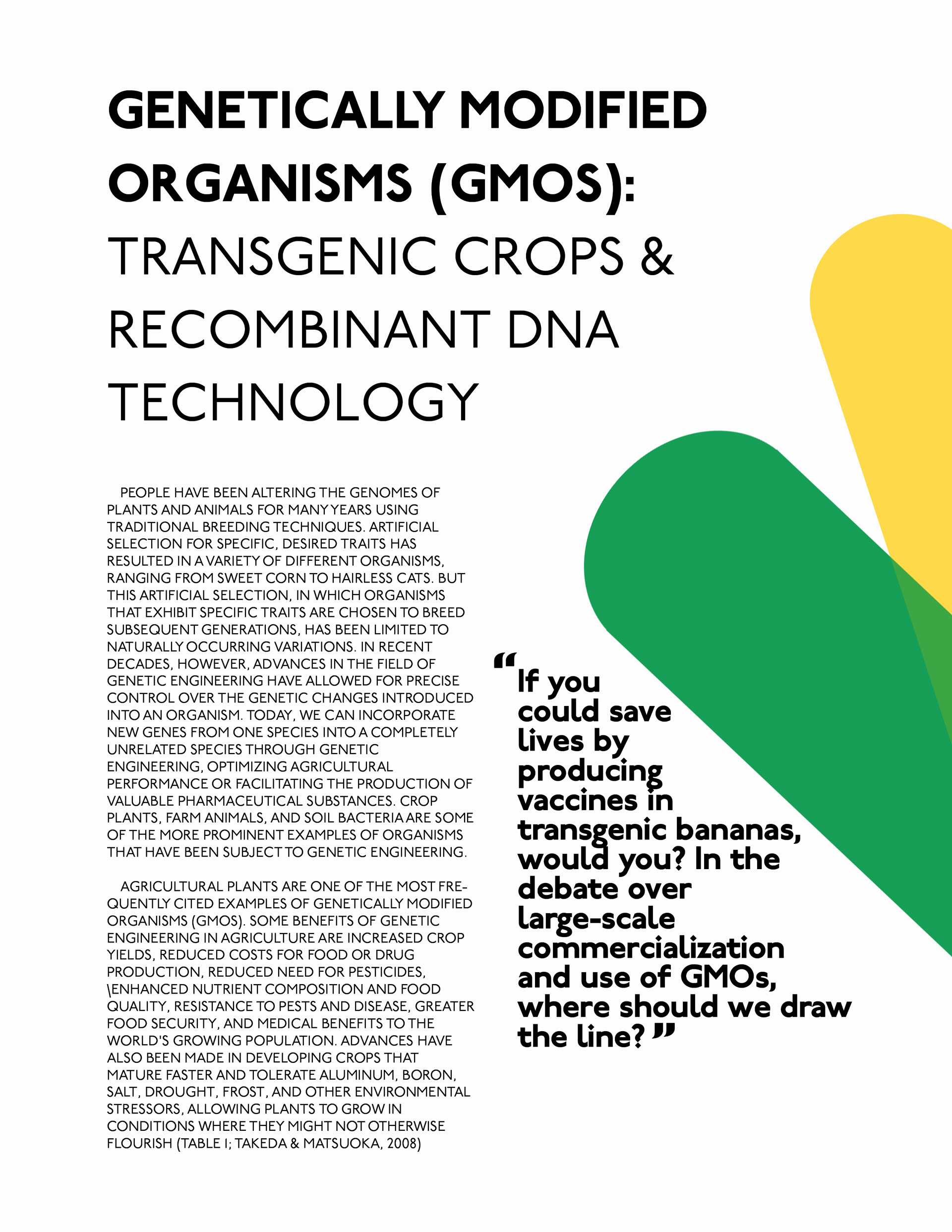

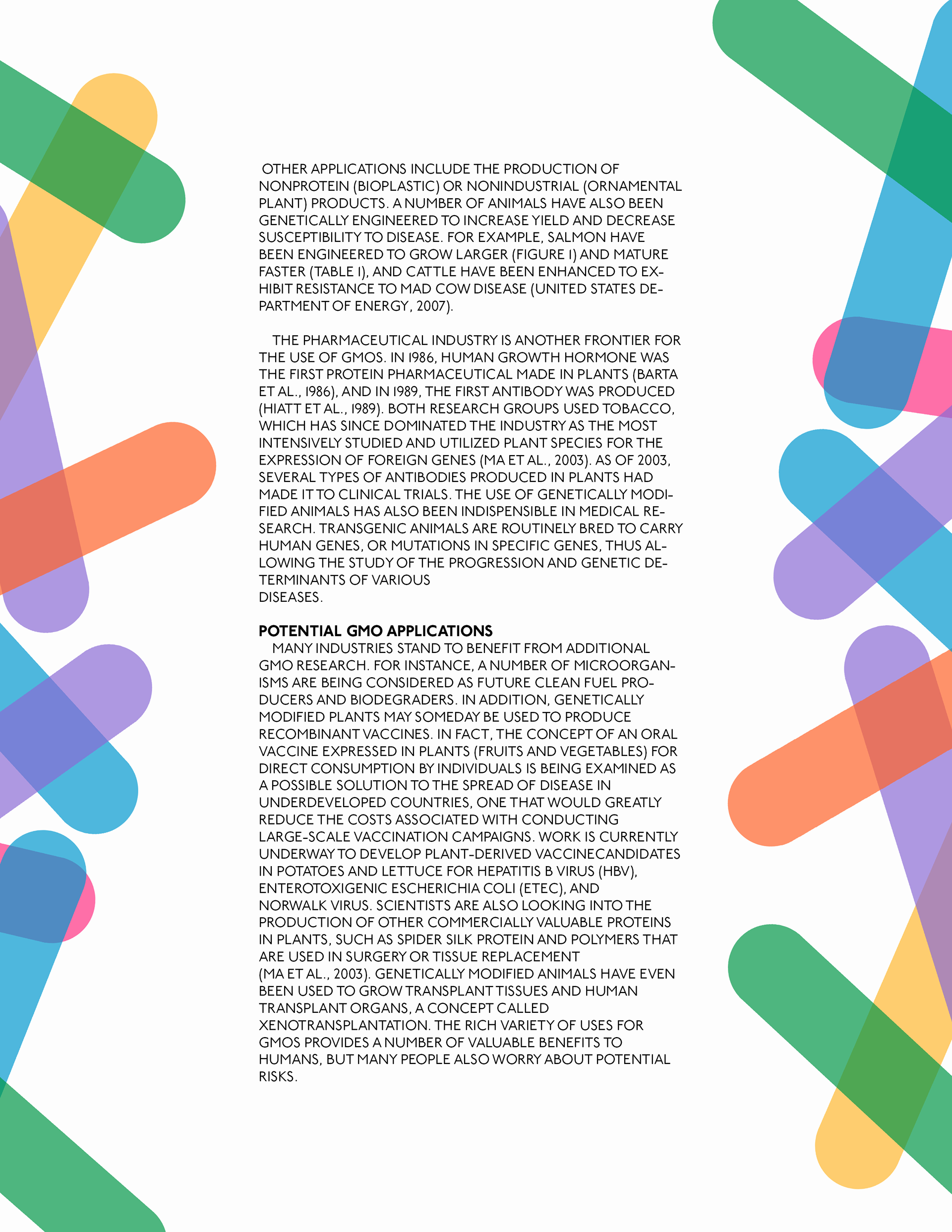
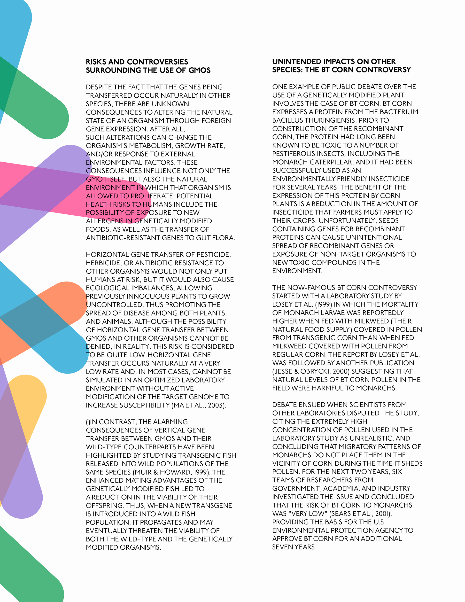
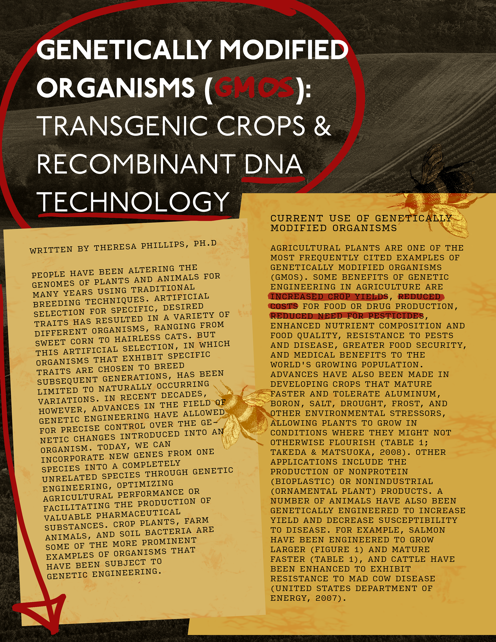
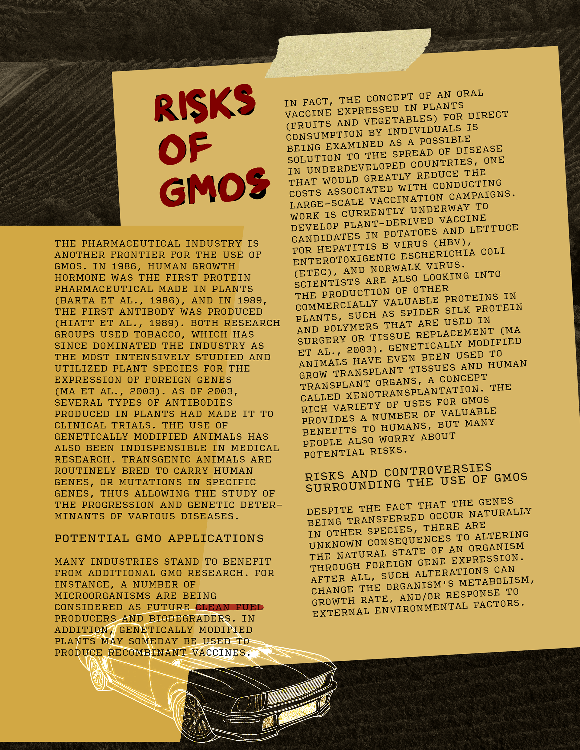
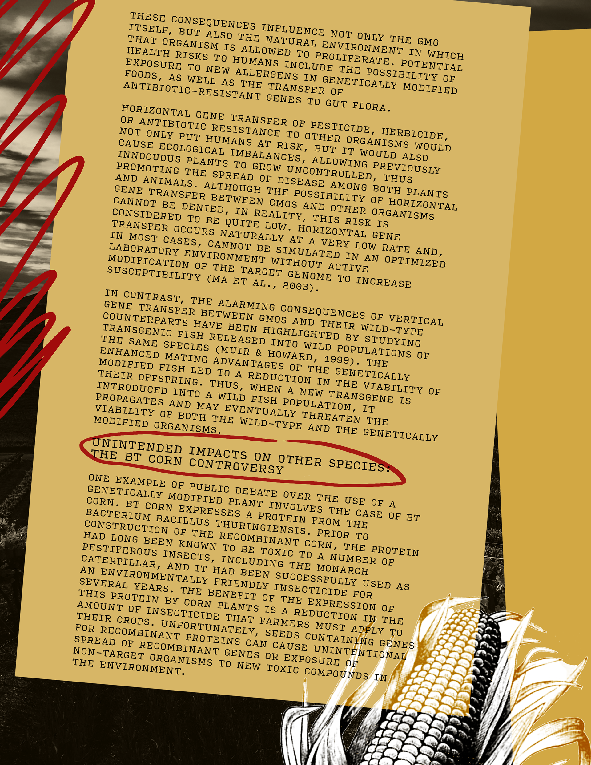
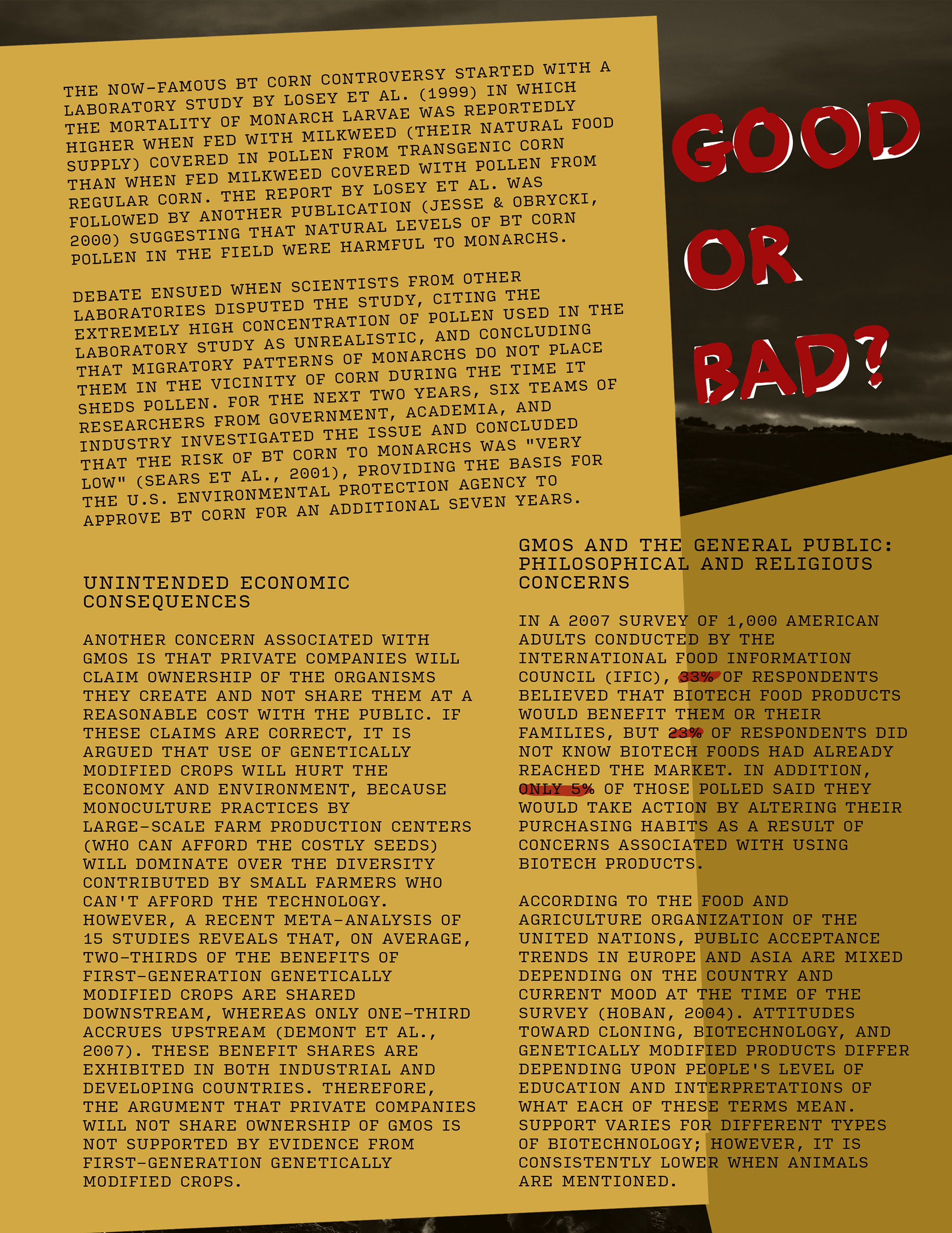
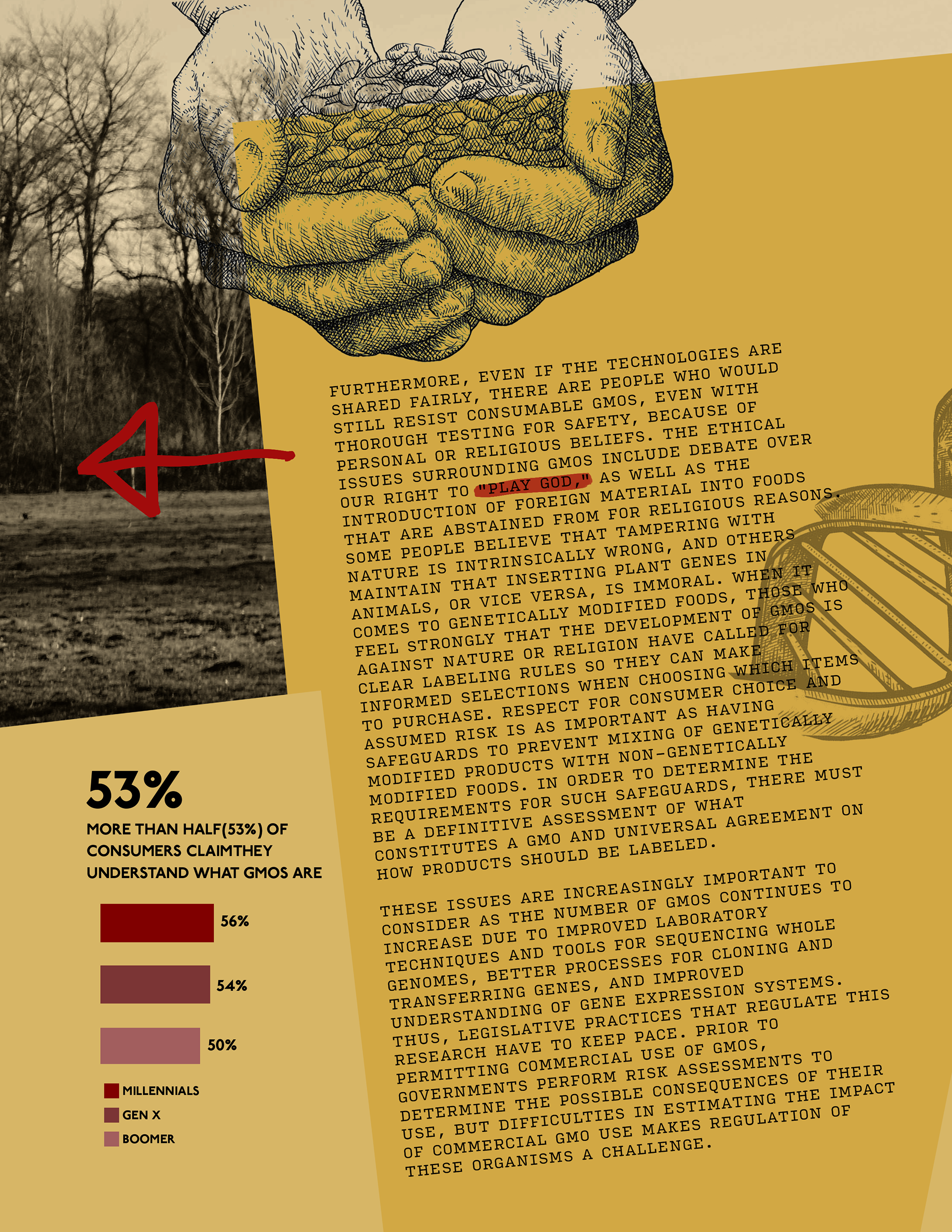
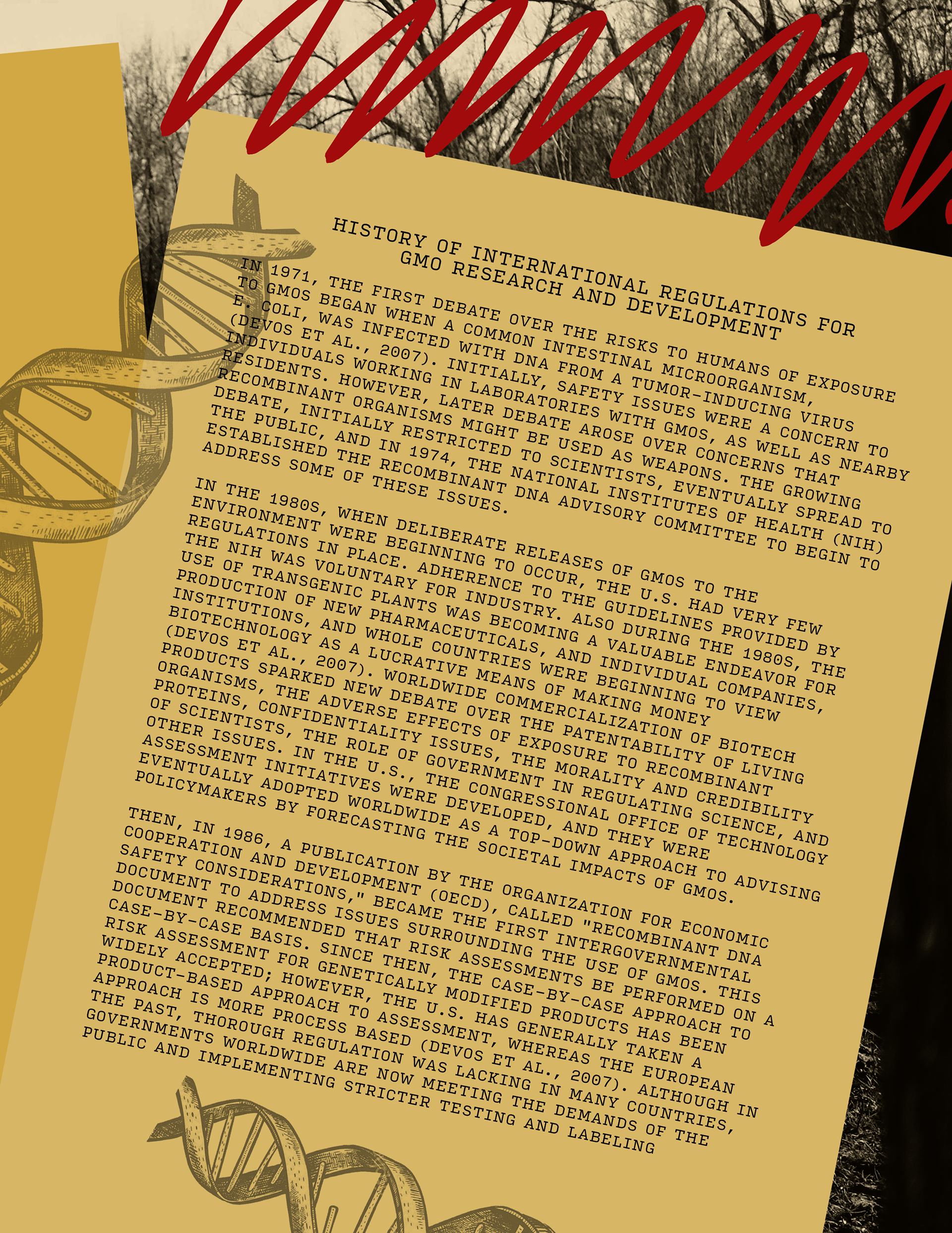
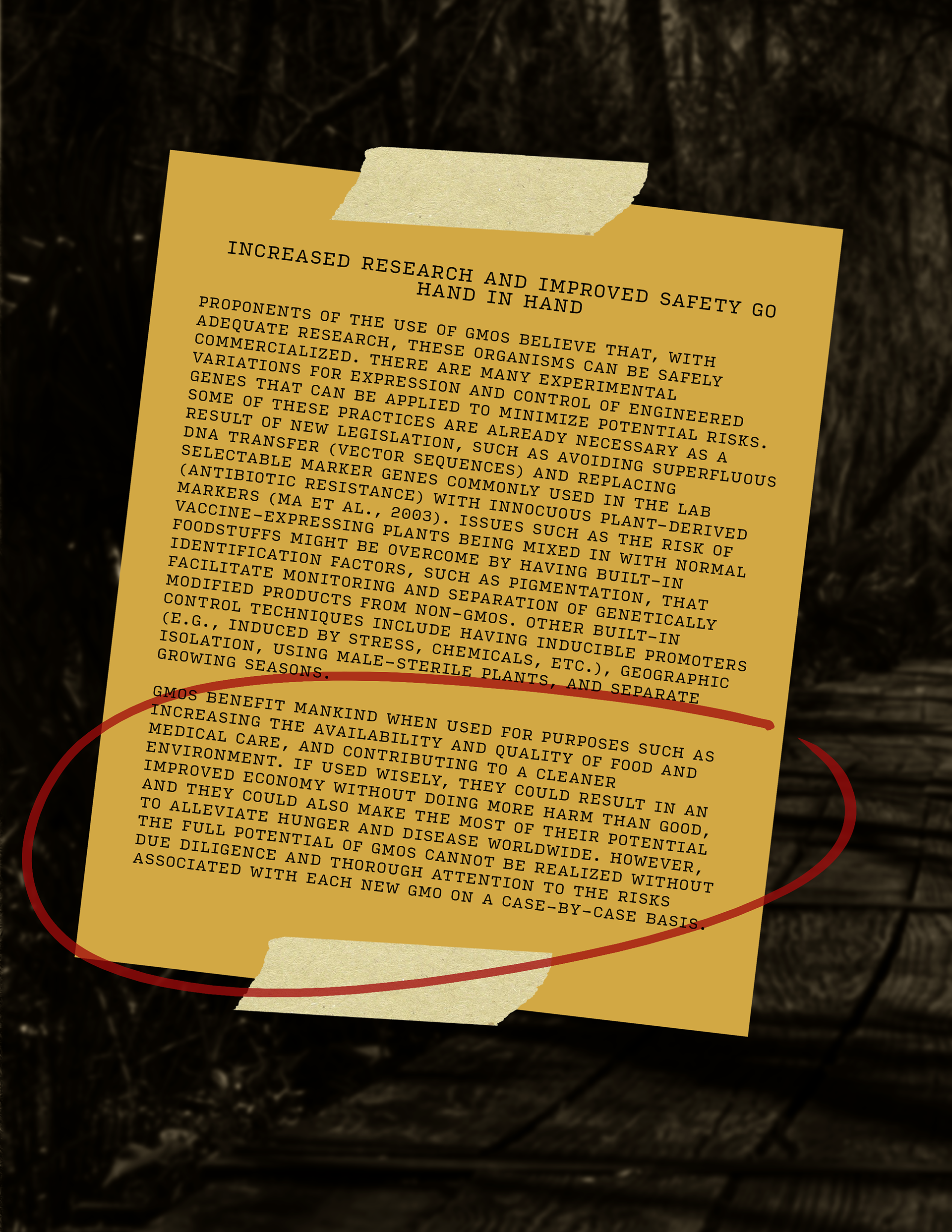
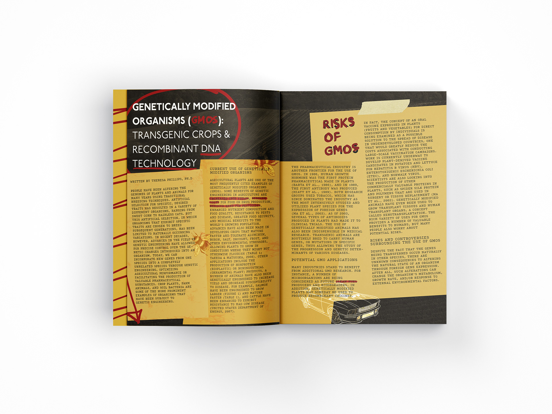
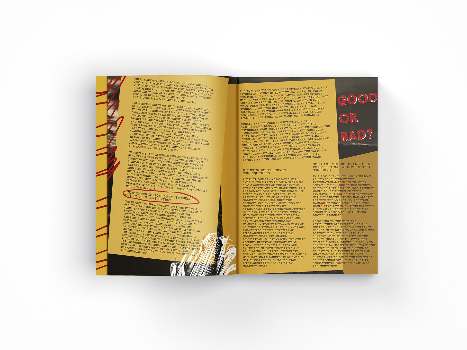
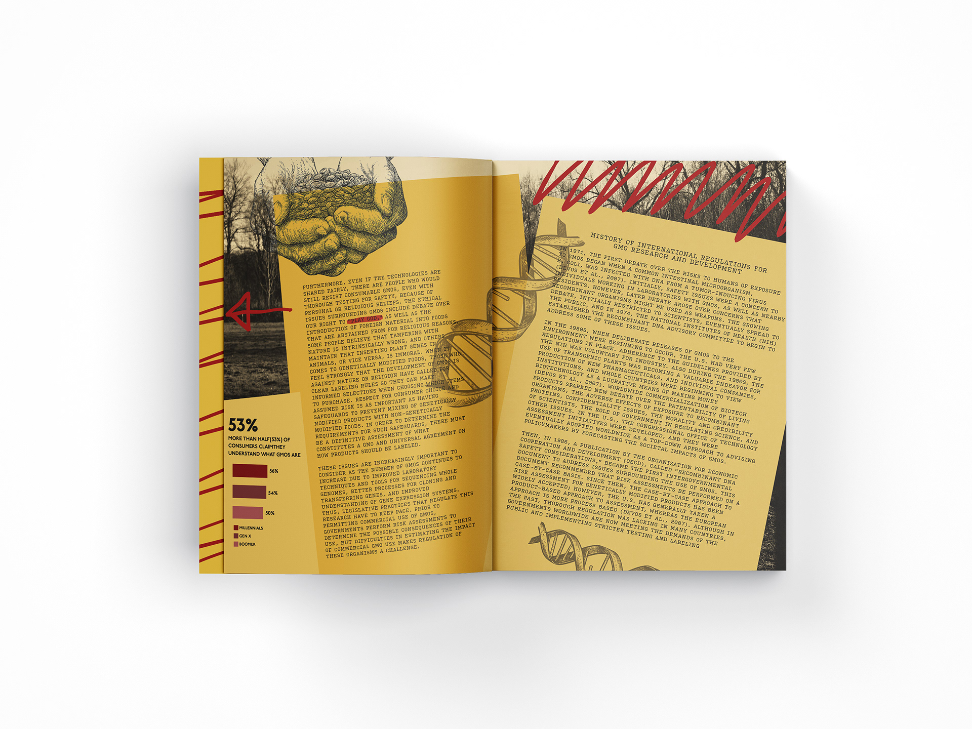
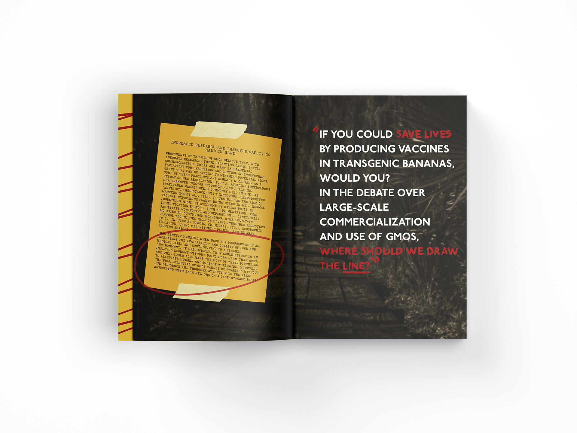
The idea for my final iteration came to when I was writing on sticky notes with a red pen and I enjoyed the color combination. I started very simple in keeping the text straight and just putting the type on top of the yellow rectangles. Although this design was very simple and clean, I wanted to explore more. So, I started moving the rectangles around and flowing them onto both sides of the page. After this, I started moving and rotating the texts to fit the rectangles but still leaving some of them vertical to reduce repetition. I then came in with my pen tool and started adding handwritten text, highlights, and lines giving it a more personal and almost crime file ascetic. After I added pictures of farming/nature landscapes to the background. I added a muted yellow tint and darkened the images to repeat yellow and make the piece cohesive. Lastly, I added images that relate to the article like the car because GMOs can help make clean fuel, and the corn because this article talks about BT corn.
Overall, I wanted the reader to see something unique and eye-grabbing but not in your face because the article is very dry and information filled. I think I achieved this by using dark background images and putting yellows over top making it stand out from the negative space. I also highlighted some key points to engage the viewer and added arrows to move the viewer's eyes. I think the contrast between the black, yellows, and reds and the use of text/image relationships make this piece interesting and unique.
